

The project: Redesign of the branch locator experience for U.S. Bank
My role: Lead Content Strategist
The team: Visual interaction designer, content strategist, experience architect, SEO specialist, researcher, product owner, scrum master, accessibility consultant & developers.
Key contributions: Competitive and research analyses, ideating and concepting, content strategy, copy creation, project tracking, global alignment, synthesizing stakeholder feedback & presenting to leadership.
Tools: Figma, Sketch, InVision Studio, Jira & Mural
Timeframe: 2021-22
Current state & problem
The content lacks a consistent POV and parity.
The filters are not comprehensive.
Tone and voice are outdated.
There are too many screens.

Lack of understanding around the ‘make an appointment’ flow
Unsure of what’s offered at the bank
Unsure of ways to bank
Unsure of how to access products
Pain points
To allow users to move freely through the experience, find what they want, when they want it.
Educate users on what it means to be a U.S. Bank customer.
Utilize our Google API feed and increase SEO value.
To meet users’ needs while addressing the business needs.
Content goals
Solution 1
Solution 1I
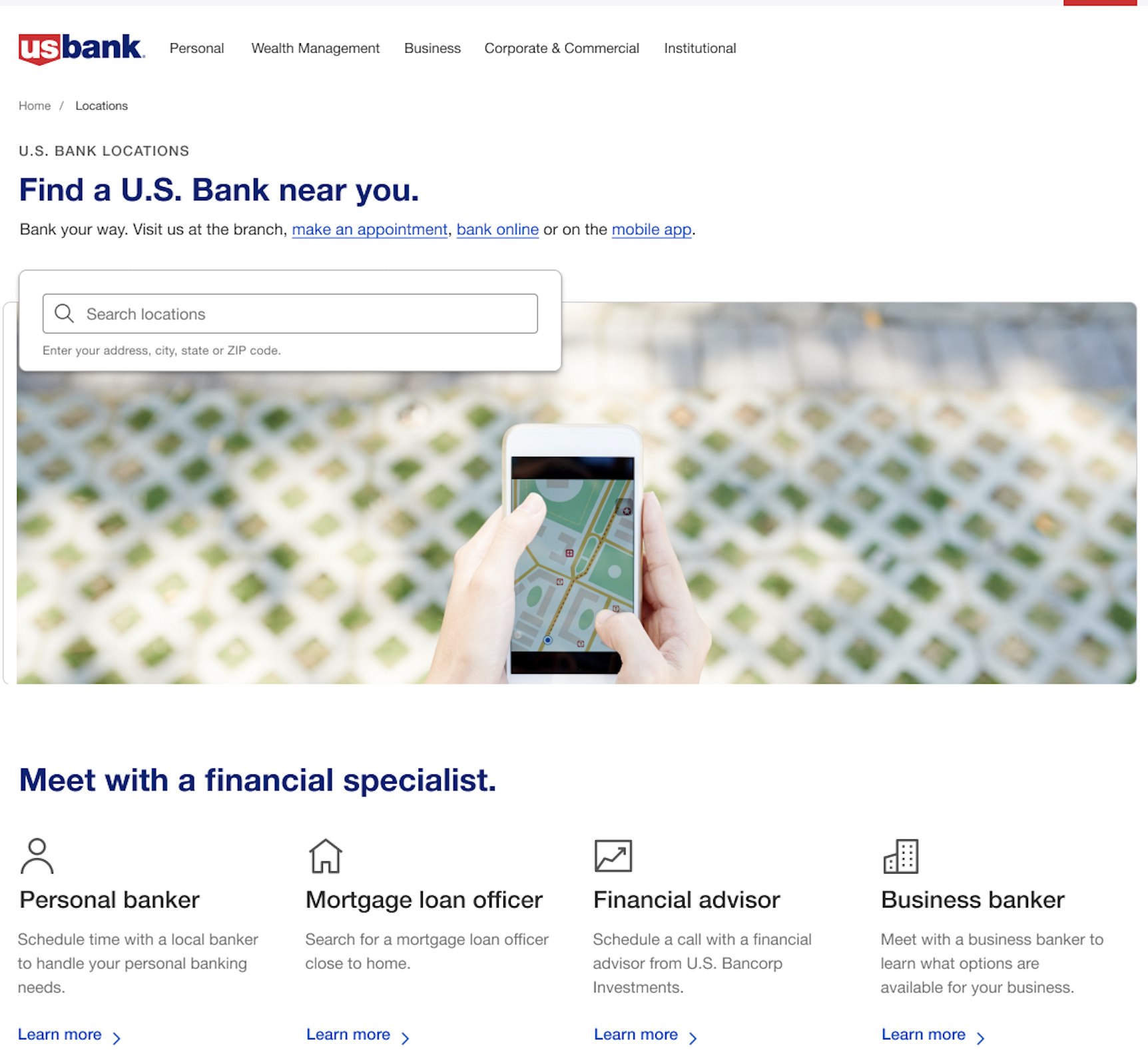
Ways to bank above the fold
Educational
Streamlined
1.Three simple categories
2. Ordered by users’ priorities
3. All the information, but not all at once


Filters & The Map
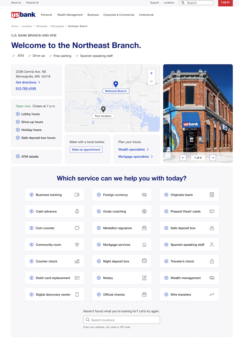
The Branch Details Page


Why it matters
Find what you need when you want it. Search. Learn. Take action.
Accessibility needs met through text links and copy placement.
Business needs met through placement and text for financial specialists.
Digital needs met through educational copy for the mobile app.
SEO needs met through FAQs and relevant google terms.
Names for filters came from research using card sorting and interviews.
Landing Page
The map meets accessibility standards with numbered pins and bank names under the selected pins.